How to Write AI Prompts for Icons and UI Design Mockups That Look Like a Real Design System
September 14, 2026 · 8 min read

Generate one icon with a quick prompt like “minimalist icon of a shopping cart” and you will likely get something clean and usable. Generate nineteen more the same way, one prompt at a time, for the rest of your icon set, and you will get nineteen icons that do not belong in the same interface: different stroke weights, different corner radii, some filled and some outlined, a couple rendered at a subtly different angle. AI image tools do not remember your first icon when generating your second one, so unless a prompt encodes the actual rules of a design system rather than just a description of a single object, consistency has to be rebuilt from scratch every time.
Why icon sets fall apart even when each icon looks fine
A UI mockup or icon set lives or dies on consistency in a way a single hero image does not, because it is judged as a set, not as individual pieces. A slightly too bold stroke on one icon among nineteen thin ones reads as a bug, not a stylistic choice, even though the exact same icon on its own would look perfectly fine. The problem is structural: most people prompt for content, “a gear icon,” “a bell icon,” “a trash icon,” and leave the actual style rules, stroke width, corner radius, fill versus outline, grid size, unstated, which means the model re-derives its own version of those rules independently for every single generation.
Write the style spec once, then reuse it
The fix is to write out the style rules as their own explicit block of the prompt, separate from what the icon depicts, and reuse that exact block, word for word, across every icon in the set: “2px stroke weight, rounded line caps, no fill, 24x24px grid, 4px corner radius on any rectangular shapes, single consistent color.” Treat that block as a locked specification, not a suggestion you rephrase each time for variety. Paraphrasing it between generations, even lightly, is often enough to shift stroke weight or corner rounding just far enough to be visible once the full set is laid out side by side.
Prompting for UI mockups, not just icons
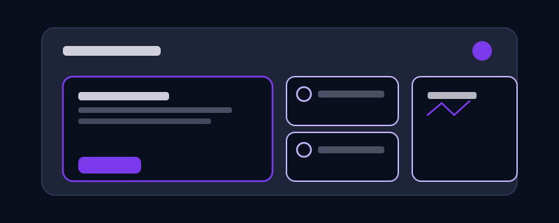
A UI mockup, a settings panel, a dashboard card, a mobile nav bar, carries the same consistency problem at a larger scale, plus layout and hierarchy on top of style. Specify the platform convention you are targeting (iOS, Material Design, a specific existing design system) rather than leaving the model to blend conventions from all of them at once, since a nav bar that mixes iOS spacing habits with Material Design elevation shadows reads as off in a way that is hard to name but easy to notice. State the actual hierarchy you need: which element is primary, which are secondary actions, whether there is a header, and roughly how much of the frame each region should occupy, rather than describing the screen’s contents as a flat list.
Getting a set to actually render as a set
Some tools let you generate a full grid of icons or UI elements in a single image, which solves the consistency problem structurally rather than through prompt discipline, since everything in one generation shares the same pass and the same underlying noise. When that is an option, prompt for the whole set at once: “a grid of six icons in the style described above: cart, heart, search, user, settings, bell,” rather than six separate generations. When a tool only generates one image at a time, the discipline of reusing an identical style-spec block becomes the only lever you have, and it is worth treating as non-negotiable rather than something to loosen for variety.
Common mistakes
Changing even one word of the style-spec block between icons in the same set, which is often enough to shift stroke weight or fill just far enough to be visible once the set is laid out together. Describing an icon by its real-world appearance, “a shopping cart like you would see at a grocery store,” instead of by the interface convention it needs to follow, which pulls the model toward photorealistic detail a flat UI icon should not have. Mixing platform conventions in a single mockup prompt, iOS spacing with Material Design shadows, instead of naming one target system and staying inside it. And treating an AI-generated icon set as final without checking it at the actual render size it will ship at, since detail that reads fine at a large preview can turn into visual noise at 16 or 24 pixels.
Editing an icon after generation
Small, targeted fixes, adjust the stroke weight, change the fill, swap one detail, are usually a job for an edit or inpainting tool rather than a full re-generation, since re-generating from scratch reopens every consistency risk you were trying to avoid. Point at the specific element that is off and describe the one change needed, keeping everything else about the style spec unchanged. The same discipline that made the set consistent in the first place applies just as much to fixing one piece of it after the fact.
None of this makes icon and UI prompting more creative, and that is the point. A design system succeeds by being boring and repeatable at the level of individual elements so the overall interface can look considered. Treating your style rules as a fixed spec you paste in unchanged, rather than a description you improvise fresh each time, is what actually gets an AI-generated set to look like it came from one hand instead of nineteen.
Frequently asked questions
Why do AI-generated icons in the same set look inconsistent?
Because each generation is independent. The model does not remember the stroke weight, corner radius, or fill style of the icon it made a minute ago unless your prompt states those rules explicitly and identically every time, so any variation in how you describe the style between icons shows up as visible inconsistency once the set is placed together.
What should a style spec for an icon set include?
Stroke weight, whether icons are filled or outline-only, corner radius on any rectangular shapes, the grid size they are designed for, and color. Write it once as a fixed block of text and reuse it word for word across every icon in the set rather than rephrasing it each time.
How do I get consistent results across a whole UI mockup, not just one icon?
Name the specific platform convention you are targeting (iOS, Material Design, or a named existing design system) instead of leaving the model to blend several at once, and state the layout hierarchy explicitly, which element is primary, which are secondary, roughly how much space each region occupies, rather than listing the screen’s contents as a flat description.
Should I regenerate an icon from scratch to fix one small detail?
Usually not. A targeted edit or inpainting tool that changes only the specific element that is wrong keeps the rest of the icon, and its consistency with the rest of the set, intact. A full re-generation reopens the same consistency risk you were trying to avoid in the first place.
Try Promptima’s image prompt generator, it locks in a consistent style spec across an entire icon set or UI mockup →
✦ Try Promptima freeMore articles
Best AI Prompt Optimizer Tools in 2026 (And When to Use Each)
Prompt marketplaces, browser extensions, manual prompt engineering, and dedicated optimizers all solve a different version of the same problem. Here is how to tell which one you actually need.
How to Turn One Photo Into a Ready-to-Use AI Video Prompt
You have an image whose look you want to bring to life as a video. The problem is that video AI tools don’t read image prompts — they need camera, motion, and duration described in a completely different structure. Here’s how to bridge the two.