How to Write AI Prompts for Logos and Brand Identity That Don't Look Like Generic Clip Art
August 31, 2026 · 8 min read
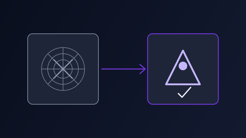
Prompt "a logo for a coffee brand" into an image tool and you will usually get something that looks like the poster for a coffee shop: a mug rendered in loving detail, steam curling off it, a warm gradient behind it, maybe a hand-lettered word arcing overhead. It is a nice picture. It is not a logo. A real mark has to hold up printed an inch wide on a cup sleeve, work as a single-color favicon, and read instantly at a glance, and none of that comes from prompting a logo the same way you would prompt a scene.
Why a logo prompt is not a normal image prompt
Image generators are trained overwhelmingly on photographs and illustrations, not on the narrow, deliberately simplified visual language of brand marks. Ask for "a logo" without further constraint and the model defaults to what it has seen far more of: a detailed, decorative image with a name attached, since that pattern is statistically closer to everything else in its training data than a genuinely minimal mark is. The gap is not a limitation you work around once, it is the starting condition every logo prompt has to fight against.
What a usable logo prompt actually specifies
A prompt that has a chance of returning something usable names the mark type up front: a wordmark (the name itself, styled), a lettermark (initials), a pictorial or icon mark, or a combination of an icon plus text. It sets a hard simplicity ceiling, ideally a one or two color limit, since color count is one of the fastest ways to tell a real brand mark from an illustration. It specifies the background, flat white or transparent, not a scene. And it names, explicitly, what to leave out: no gradient, no drop shadow, no photorealistic texture, no fine detail that disappears at small size. Every one of those exclusions is doing real work, because each is a default tendency of the model that a generic "make it a logo" instruction does nothing to override.
The vector problem no prompt can fully solve
Every mainstream AI image tool outputs a raster image, a fixed grid of pixels, not a vector file. A logo eventually needs to exist as a vector (an SVG, AI, or EPS file) so it can scale from a favicon to a billboard without going soft or blocky. No prompt makes an image model output real vector paths. What a good prompt can do is produce a raster concept clean enough to redraw or trace into vector form without a fight: hard edges, flat fill, high contrast between the mark and its background, no gradient or texture for a tracing tool to choke on. Treat the AI output as the concept sketch, not the deliverable, and this stops being a problem instead of a disappointment.
Choosing a tool for brand identity concepts
Midjourney produces the most polished-looking results but leans hardest toward decorative detail, so it needs the heaviest constraint language: flat, single color, vector style, minimal, negative space. Ideogram handles in-image text more reliably than most alternatives, which makes it the stronger pick for a wordmark or a mark that needs actual legible lettering baked into the design. Recraft is the closest thing among mainstream tools to genuine vector output, with a dedicated vector generation mode that skips much of the raster-to-vector cleanup step. DALL-E through ChatGPT works fine for loose early exploration, brainstorming shapes and directions, but tends to be the weakest at staying genuinely minimal once you ask for restraint.
Testing a mark before committing to it
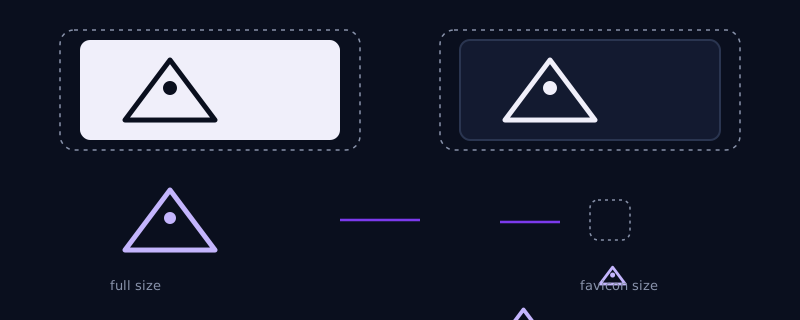
Before treating any generated concept as a real candidate, run it through the size and contrast test it actually has to survive. Shrink it, mentally or by literally resizing the image, down to the size it will really appear: a favicon, an app icon, a social profile picture. View it in a single flat color instead of whatever palette it generated in. Check it against both a light and a dark background, since a real brand mark has to appear on both. A mark that only reads clearly at large size in full color is not finished, it needs another pass with tighter negative-space and simplicity constraints in the prompt.
Common mistakes
Prompting "logo for [company]" with no mark type specified and getting a busy illustration with the company name overlaid on top of it, since nothing in the prompt ruled that pattern out. Leaving off explicit exclusions like "no gradient, no drop shadow, no photorealistic texture" and getting all three anyway, because these are default style tendencies the model reaches for unless specifically told not to. Asking for rich, full color complexity when brand identity work almost always needs a working one-color version, and finding out only later that the mark falls apart the moment it is printed in black. Treating a generated raster image as the finished deliverable instead of the starting concept for a proper vector redraw.
Where Promptima handles this
Logo and brand identity work is one of the clearest cases where the same generic image prompt that works for a poster or a scene actively works against you, since the constraints that make a mark usable (mark type, color limits, exclusion terms) are the opposite of what makes a striking illustration. Promptima's prompt optimizer adds those constraints automatically when you describe the brand and pick an image tool, rather than leaving it to you to remember which qualifiers keep the result from turning into decorative clip art.
Frequently asked questions
Can AI generate a logo I can use directly, with no further work?
Not as a finished, production-ready file. AI image tools output raster images, not vector files, and a real logo needs to exist as a vector to scale cleanly from a favicon to a billboard. Treat the AI output as a concept, then have it redrawn or traced into a proper vector file before using it as an actual brand asset.
Which AI tool is best for logo design?
It depends on what you need. Recraft has a dedicated vector generation mode, the closest thing to true vector output among mainstream tools. Ideogram handles in-image text more reliably, useful for wordmarks. Midjourney produces the most polished aesthetic exploration but needs heavier constraint language (flat, single color, minimal) to avoid decorative detail.
Why do AI logo prompts keep returning full illustrations instead of simple marks?
Image models are trained mostly on photographs and illustrations, not the deliberately simplified visual language of brand marks, so a vague "make me a logo" prompt defaults to what the model has seen more of. Naming the mark type, a color limit, and explicit exclusions like no gradient or no drop shadow overrides that default.
How do I know if a generated logo concept will actually work as a real logo?
Test it the way it will actually be used: shrink it down to favicon size and check it still reads, view it in a single flat color instead of its generated palette, and check it against both a light and a dark background. A mark that only holds up at large size in full color needs another pass with tighter simplicity constraints.
Try Promptima's prompt optimizer, tuned for logo and brand identity prompts too →
✦ Try Promptima freeMore articles
Best AI Prompt Optimizer Tools in 2026 (And When to Use Each)
Prompt marketplaces, browser extensions, manual prompt engineering, and dedicated optimizers all solve a different version of the same problem. Here is how to tell which one you actually need.
How to Turn One Photo Into a Ready-to-Use AI Video Prompt
You have an image whose look you want to bring to life as a video. The problem is that video AI tools don’t read image prompts — they need camera, motion, and duration described in a completely different structure. Here’s how to bridge the two.